Mobile Website Experience: Make Accommodation Easier to Book
Make your accommodation website easier to use on a phone, from readable room details and fast images to a reliable booking-engine handover.

A good mobile accommodation website lets a traveller understand the stay, check the practical details and move towards a booking without pinching, guessing or fighting the screen. A page that technically fits a phone is only the starting point.
The mobile experience includes your room content, navigation, forms and booking engine. Improving one page while leaving the handover broken will not solve the guest’s problem.
Mobile-friendly is not the same as easy to book
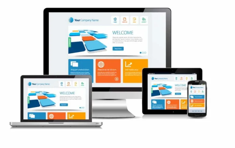
Responsive design adapts a page to different screen sizes, usually using the same underlying content and URL. It reduces the need to maintain separate desktop and mobile websites, but it does not automatically produce a useful layout.
On a phone, check whether people can read room details, compare options, open the menu, use the date picker and understand the total price. A giant image, oversized heading or persistent overlay can obstruct the journey even when there is no horizontal scrolling.
The earlier mobile-friendly article correctly connected usability with the whole guest experience. Retain that perspective: the promise of thoughtful hospitality begins with how easily a guest can find accurate information and get help.
Keep important content available on mobile
Google uses mobile content for mobile-first indexing. Keep the essential room descriptions, meaningful images, headings, links and structured data available on smaller screens, rather than removing useful information to make the page look shorter. See Google’s mobile-first indexing guidance.
Responsive design is not a guarantee of rankings, and a non-responsive page is not automatically excluded from all search results. The practical goal is a fast, understandable page that works for people and can be accessed by search systems.
Make performance part of the design
Use appropriately sized, compressed photographs and avoid delivering a huge desktop image to a small phone. Set image dimensions so that text and buttons do not jump when media loads. Do not lazy-load the primary above-the-fold image if doing so delays its display.
Keep fonts, plugins, animation and third-party scripts under control. A video background or several review widgets may add more delay than value. Preserve the authentic property imagery that helps guests make a decision; performance should not turn the website into an empty brochure.
Google’s Core Web Vitals assess loading, interaction responsiveness and visual stability. Their good thresholds are LCP at or below 2.5 seconds, INP at or below 200 milliseconds and CLS at or below 0.1, assessed at the 75th percentile. Use the official Web Vitals definitions, not an arbitrary promise that every page will load instantly.
Test the booking journey, not just the homepage
- Open a room page from a search or social link, not only from the homepage.
- Find occupancy, bed setup, inclusions, location and relevant policies.
- Tap the availability action and check what survives the handover.
- Choose dates and guests, review the total and inspect the payment explanation.
- Return to the property page without losing your place or becoming trapped.
Stop before committing a reservation or payment unless an approved controlled test is in place. When a third-party booking engine causes a problem, record the device, step and visible error so the provider can reproduce it.
Buttons should be easy to tap and keyboard focus should remain visible. Labels must explain what a field needs, and validation errors should help someone correct it. Do not depend on mouse hover, tiny icons or colour alone.
Make practical answers and contact options easy to find
Travellers may be on a variable connection, already on the road or comparing several properties. Give clear directions, parking details, check-in arrangements and genuinely useful local information. Do not hide a critical access limitation at the bottom of a long gallery.
Offer an accessible enquiry or phone route for questions that cannot be answered online. Explain response hours and avoid demanding excessive information before someone can ask a simple question. A contact option complements online booking rather than replacing it.
Build for search and AI-assisted discovery without gimmicks
Use descriptive page titles, one clear main heading and logical subheadings. Write direct answers to real guest questions, retain accurate location details and connect related accommodation and destination pages with descriptive links.
Keep important information as readable page text, not only inside photographs or a tool that requires interaction to reveal it. Article or business schema should match visible facts. No special mobile markup or AI plugin can compensate for inaccurate content or a blocked booking path.
Review on real devices and improve the right problem
Combine lab tests with real-device checks and field performance data when enough traffic is available. A single Lighthouse score is a useful diagnostic, not proof that all guests have the same experience. Test important templates, slow connections and the third-party booking handover.
Compare mobile and desktop enquiries, booking starts and completed reservations where tracking supports it. An apparent mobile conversion gap can also reflect traveller behaviour, consent or missing cross-domain data, so investigate before redesigning blindly.
Our booking-button guide turns these checks into practical conversion improvements. TMSA builds booking-focused WordPress websites with usability and the wider guest journey in mind.
A clearer path to more direct bookings.
Bring your website, search visibility, advertising and content together around your accommodation brand.